Real work.
Real outcomes.
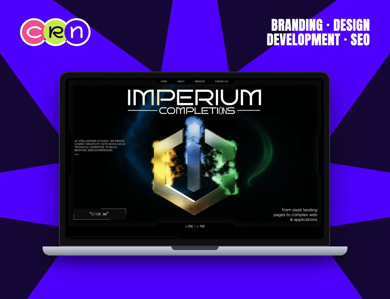
A studio that sells web experiences has to be one, so the homepage stopped describing the work and started being it.
One object carries the hero: a metallic emblem suspended in a nebula, lit from four sides. Everything else on the screen gets out of its way: a thin nav, one paragraph, one invitation to click.
The dark palette is a working choice, not a mood. Against near-black, the artwork is the only thing with colour, so the eye has exactly one place to land.
Designed in Figma, built in Webflow, shipped as a single scroll from landing-page work to full applications.
View case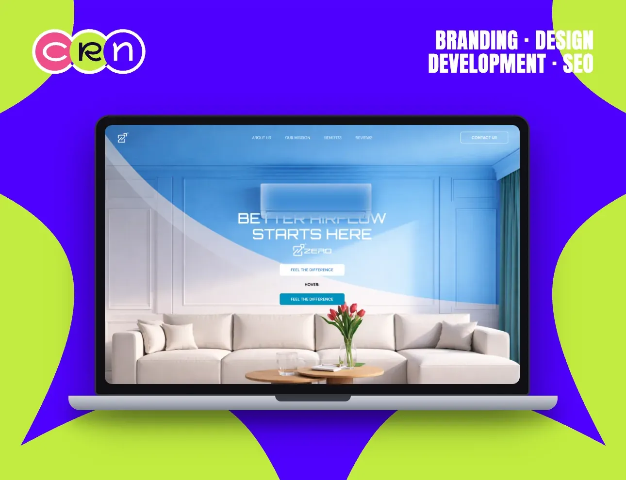
Air conditioning is invisible until it's wrong. The page had to make comfort something you could see.
The hero is one room (panelled walls, white sofa, tulips on the table) with the unit sitting quietly in it. The product isn't hero-shot in a studio; it's shown doing its job in a home someone would want.
A cool gradient sweeps the room from the top corner: the airflow itself, drawn as light rather than arrows and diagrams.
One button, one promise (feel the difference) carried from the hero through mission, benefits and reviews.
View case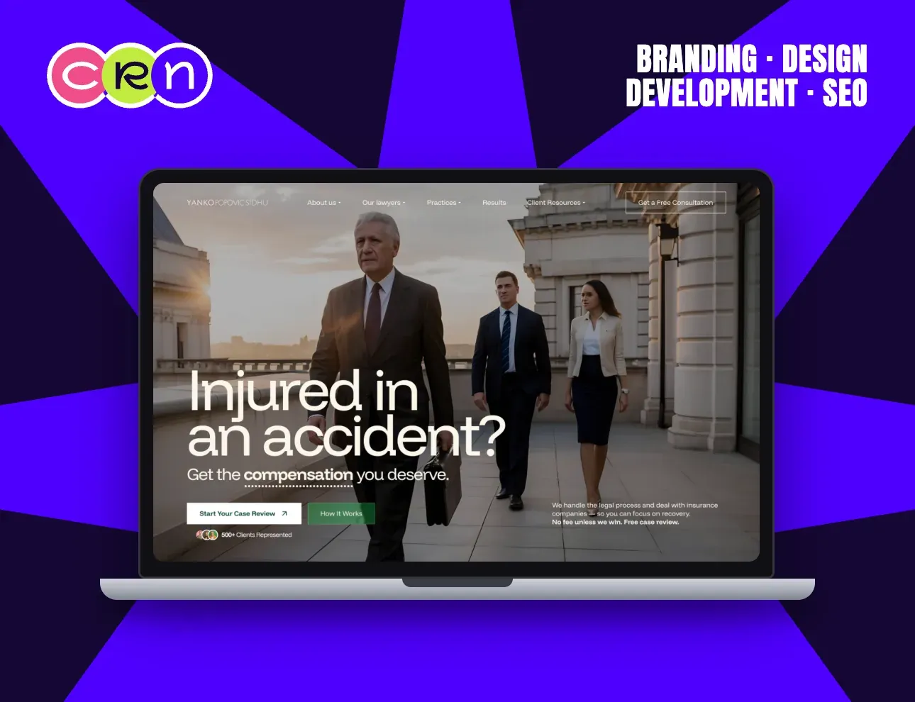
A personal-injury firm gets one question from every visitor, so the homepage asks it first: injured in an accident?
The answer sits directly underneath (get the compensation you deserve) and the two things a hurt person actually needs are the only buttons on the screen: start your case review, or see how it works.
The photograph does the reassurance. Three lawyers, a courthouse, evening light: seniority you can read in a second without a word of self-praise.
Everything that removes risk is above the fold (500+ clients represented, no fee unless we win, free case review) because that's the objection that stops the call.
View case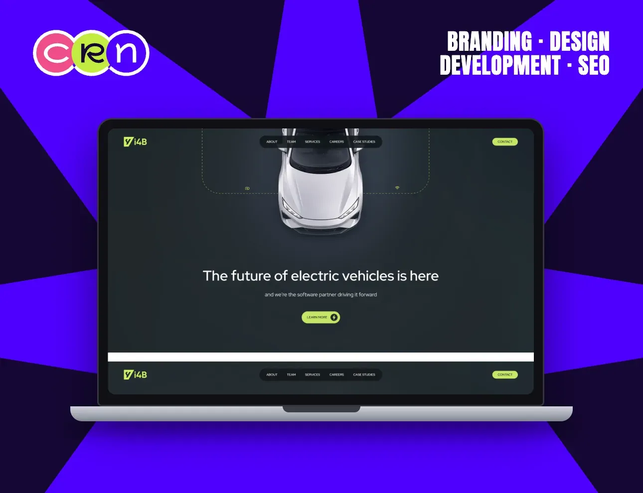
An engineering partner is hard to photograph. So the car is the picture, and the software is drawn around it.
The vehicle sits top-down in the dark; a dotted line traces a circuit around it, picking up sensor and connectivity marks as it goes. That single graphic says software partner faster than a page of copy.
Acid-lime on charcoal keeps the palette to two moves, so the CTA is the brightest thing on the page by construction.
The nav is the whole business in six words (about, team, services, careers, case studies, contact) and every one of them is a page a serious buyer will open.
View case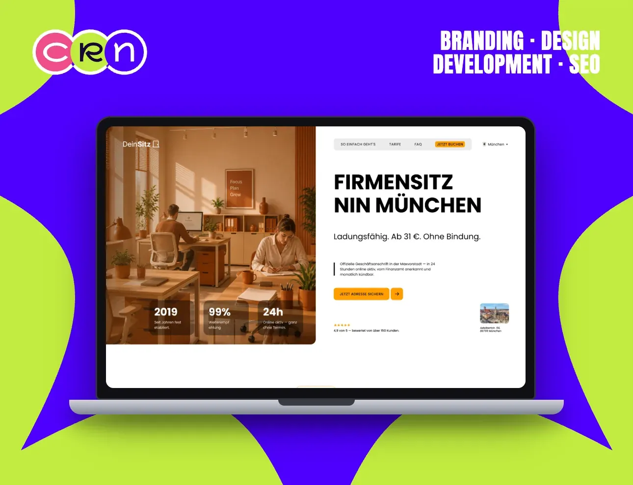
A registered business address in Munich, sold to founders who want the paperwork gone in an afternoon.
The split hero puts the room on the left and the offer on the right: ladungsfähig, ab 31 €, ohne Bindung. Price, legal standing and no lock-in (the three things that decide this purchase) stated before anything else.
Three proof tiles ride the photograph: established since 2019, 99% would recommend, active online within 24 hours, no appointment.
German throughout, with the city switcher in the nav, because this is a local product and the page had to read as one.
View case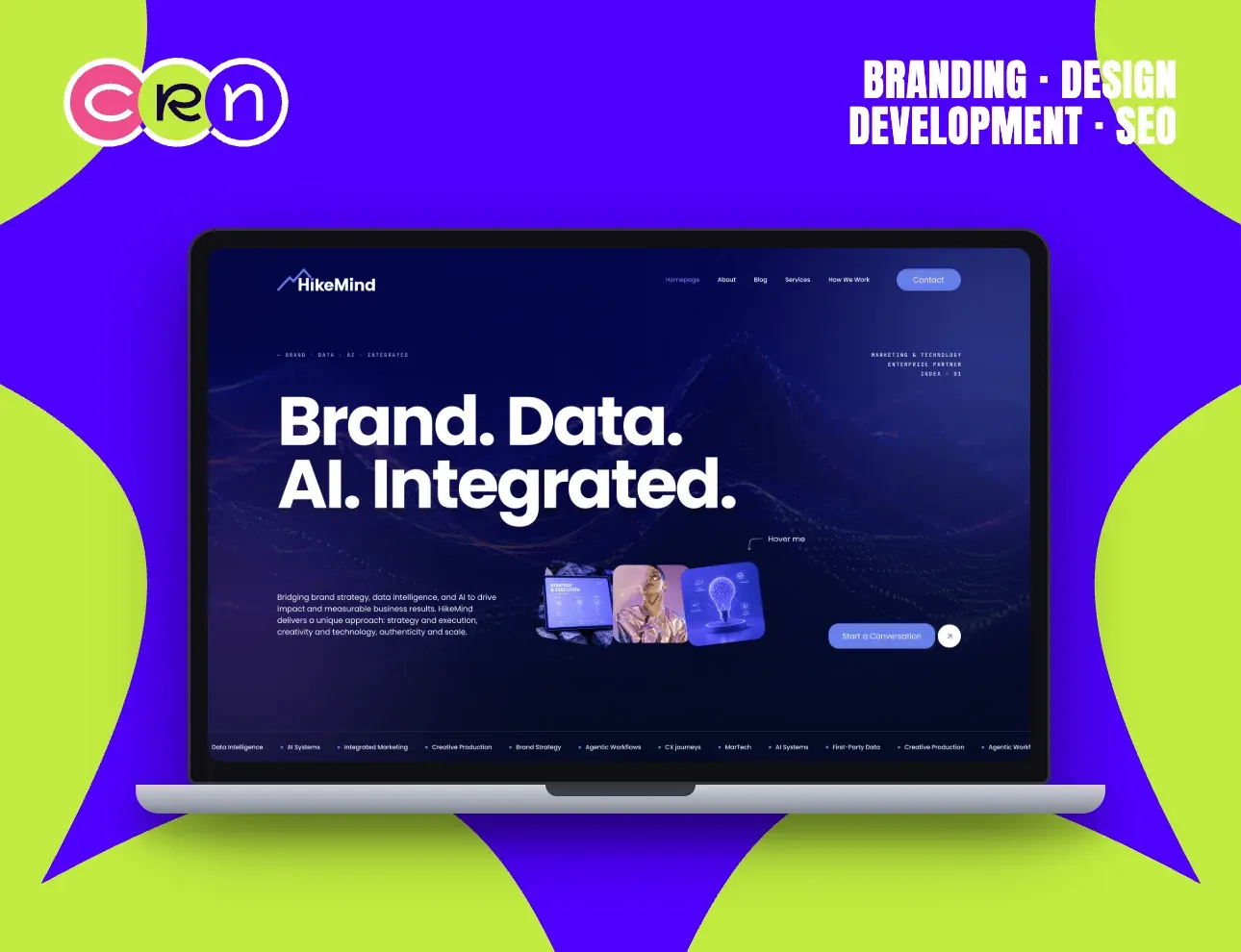
Four words had to hold a whole positioning: brand, data, AI, integrated.
They're set as four sentences, not a list, so each one lands on its own, then the paragraph underneath spends its whole length on what the combination actually delivers.
The background is a data-drawn mountain range: the brand's name made literal, and a texture that reads as analytics rather than decoration.
A hover strip of floating cards previews the capability set (AI systems, first-party data, creative production, agentic work) before the visitor commits to a scroll.
View case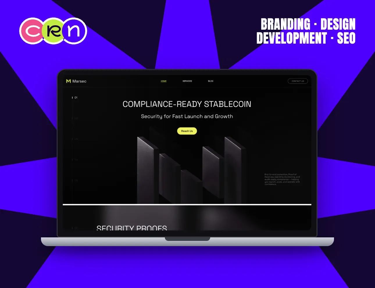
Stablecoin infrastructure sells on one feeling: nothing here is improvised.
So the page is almost entirely black, set in a monospaced face, numbered 01 through 05 down the left margin like a specification rather than a pitch.
The headline pairs the two things this buyer has to reconcile (compliance-ready, and fast to launch) and refuses to trade one for the other.
The detail sits in one small block at the foot of the hero: end-to-end protection, proof of reserves, real-time monitoring, audit-ready compliance. One yellow button is the only colour on the screen.
View case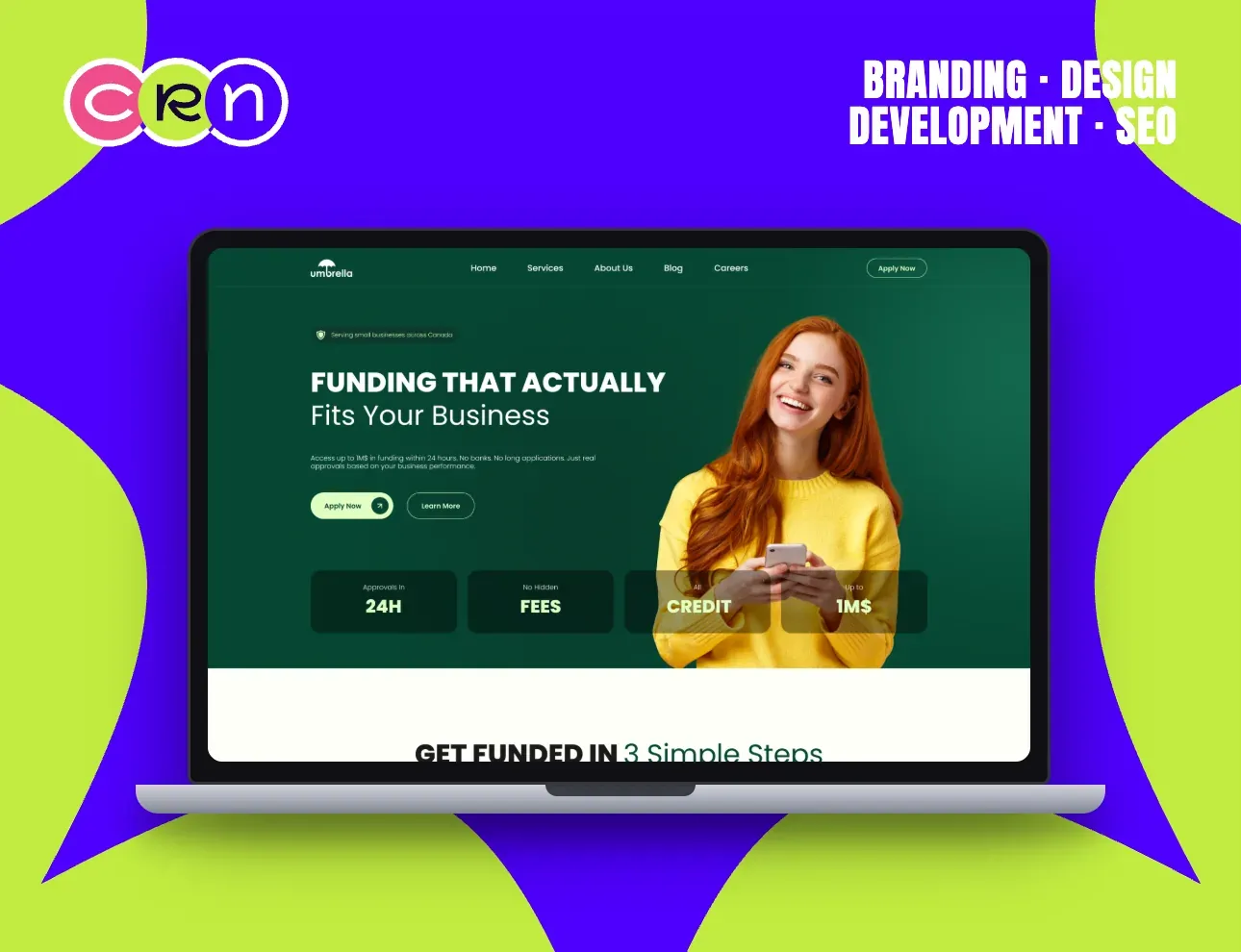
Small-business lending is a trust problem before it's a money problem. The word 'actually' is doing the work in that headline.
It's aimed straight at what the visitor already believes (that funding offers never fit) and the paragraph underneath answers it in plain terms: up to 1M$ within 24 hours, no banks, no long applications, approvals based on business performance.
The photograph is a customer, not a boardroom. Yellow against deep green makes her the warmest thing on a page about money.
Three tiles pin the terms where nobody can miss them (approvals in 24H, no hidden fees, up to 1M$) and Apply Now repeats in the nav and the hero.
View case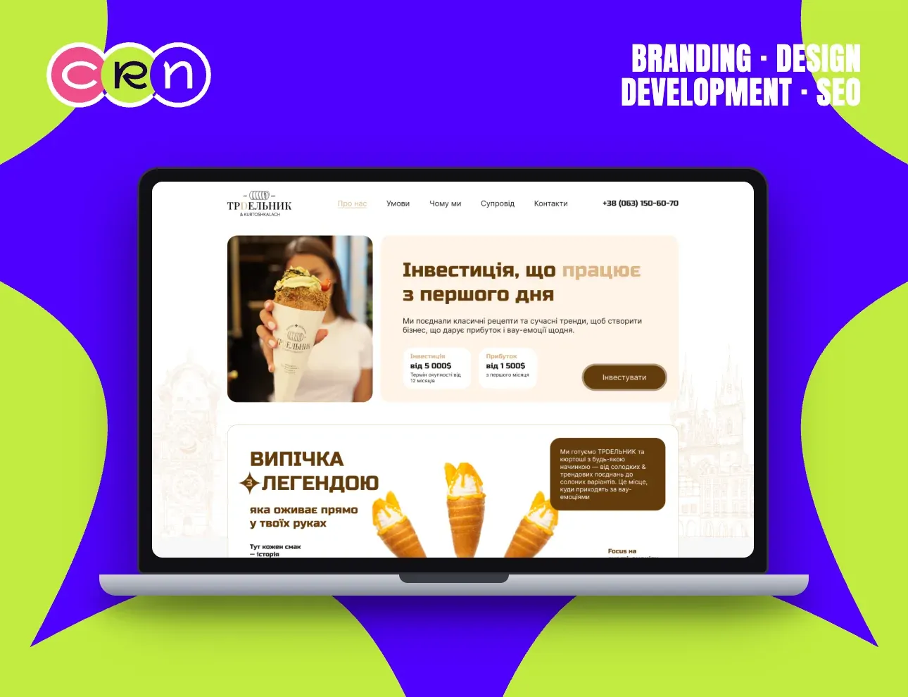
Two audiences, one page: the investor buying a franchise, and the customer who has to want the pastry.
The investor gets the top of the page and hard numbers (investment from $5,000, profit from $1,500 in the first month, payback from 12 months) sitting beside a single photograph of the product being eaten.
The appetite argument runs underneath: baking as a legend, sweet through savoury fillings, an old-Prague line drawing behind it all.
Warm browns and creams, a Ukrainian-language build, and a phone number in the nav, because this deal still closes on a call.
View case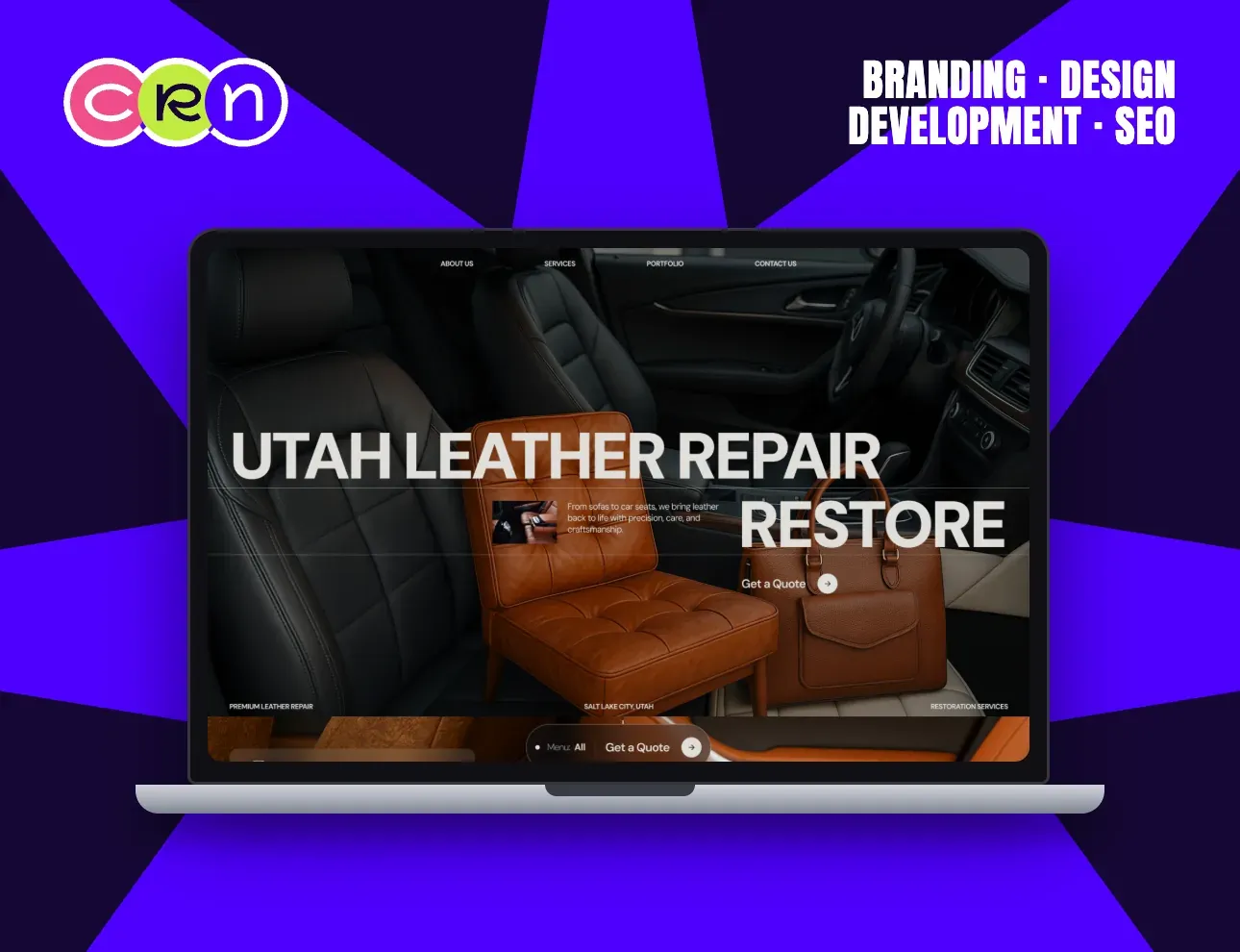
Restoration work only sells on evidence, so the whole hero is evidence.
Three pieces of leather sit in one frame (a car interior, an armchair, a briefcase) which is also the full range of the business, shown instead of listed.
The type layers over and behind the objects so the shot reads as one composition rather than a headline pasted on a photo.
Two anchors keep it local and concrete: Salt Lake City, Utah in the corner, and Get a Quote as the only thing to click.
View case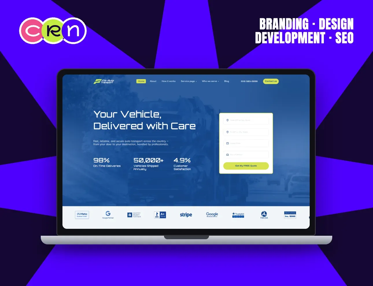
Nobody browses a car-shipping site. They want a price, so the price form is the hero.
Four fields and a yellow button sit beside the headline: from, to, pickup date, size of vehicle. The visitor can be mid-quote within seconds of arriving.
The left column earns the submit (98% on-time deliveries, 50,000+ vehicles shipped annually, 4.9 customer satisfaction) set large enough to read at a glance.
A partner strip runs directly under the fold, so the proof keeps going while the form stays in view.
View case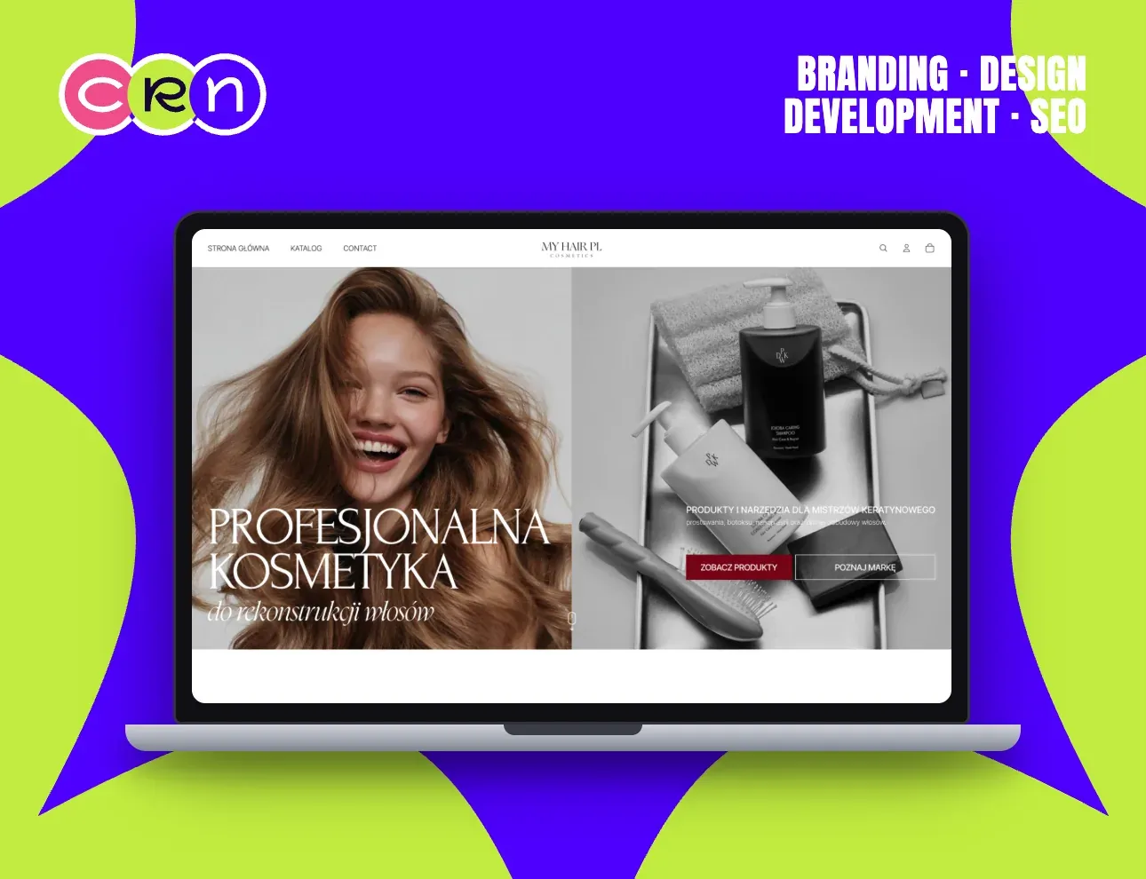
A build-only job: the brand had the art direction, and it had to survive the move into a working store.
The hero is a hard 50/50 split (the model on one side, the product still life on the other) with the serif headline breaking across the seam so the two halves read as one page.
Almost everything is black and white; the single red button is the only place the eye is asked to go.
Built in Webflow with the catalogue, cart and account behind it, and the editorial layout kept intact at every width.
View case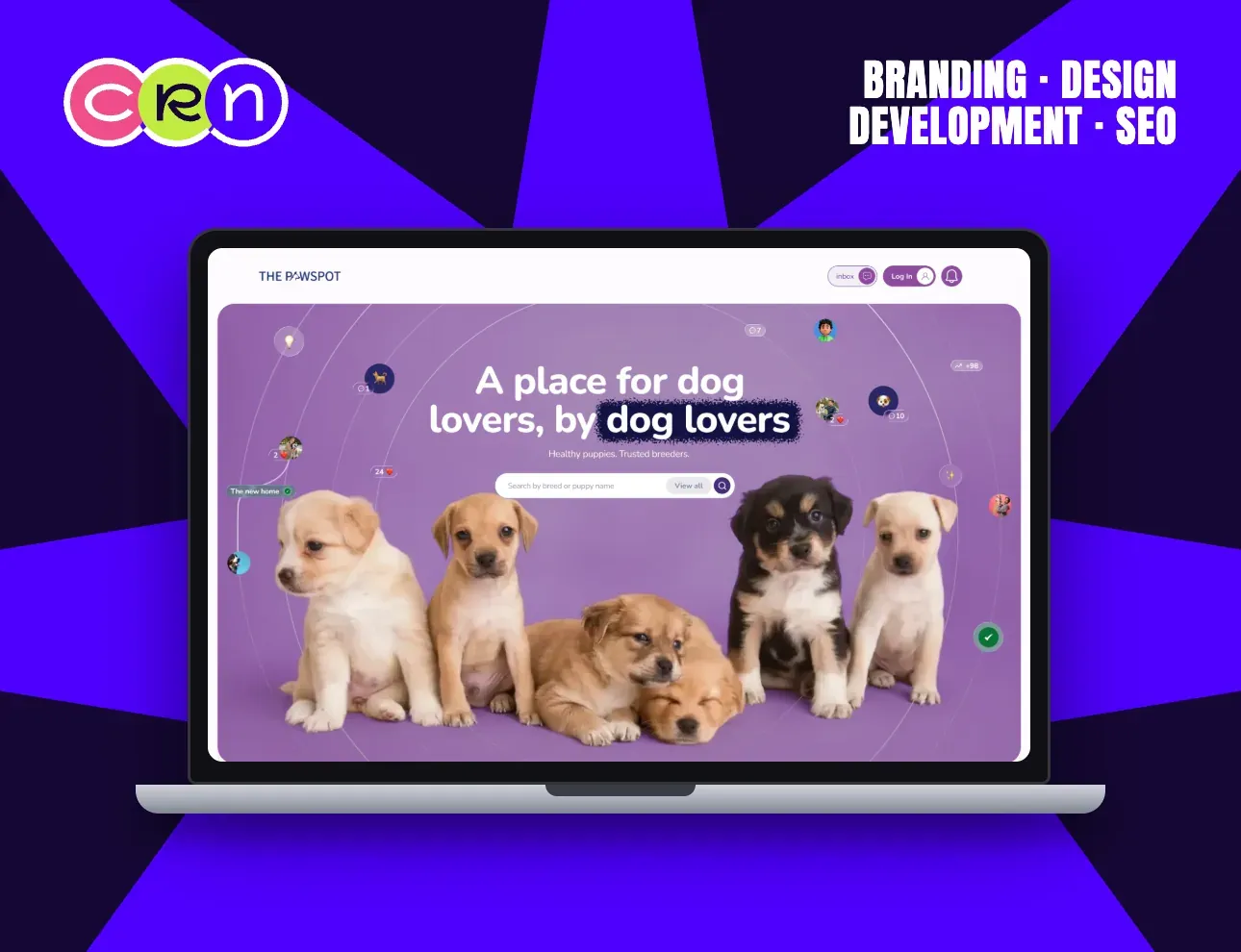
A marketplace between breeders and buyers only works if the buyer trusts it, so the page leads with who's already there.
Breeder and buyer avatars orbit the headline on wide arcs, each with a small live badge. The network is visible before a single listing is.
Underneath, the promise is two short sentences (healthy puppies, trusted breeders) and then the search field, because breed is how this visitor actually thinks.
Five puppies fill the lower half at full height. It's a product photo and an argument at the same time.
View case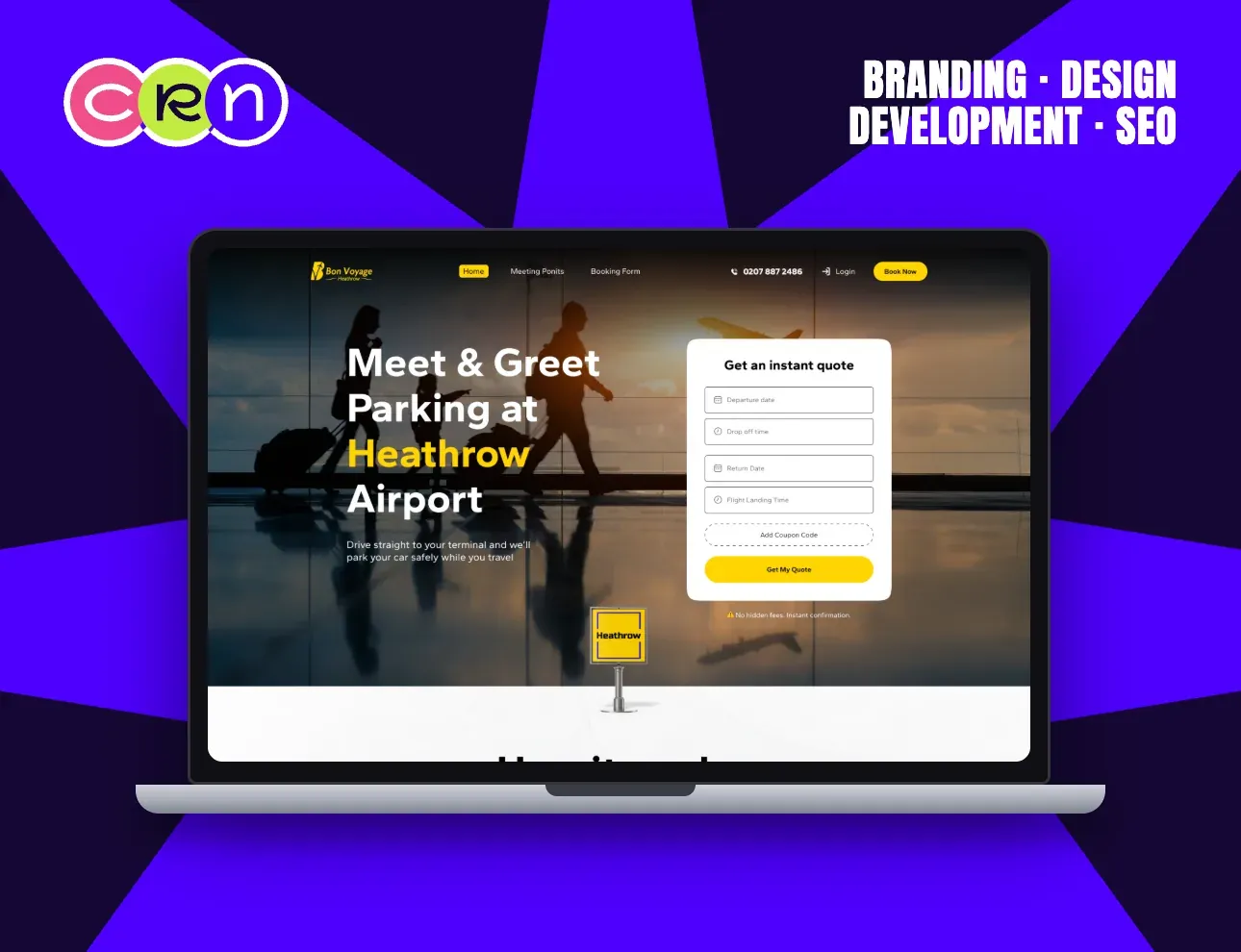
Airport parking is booked in a hurry, usually the night before. The page is built for that state of mind.
The quote form is the first thing in reach: departure date, drop-off time, return date, flight landing time, coupon code. Nothing optional, nothing to read first.
The headline names the exact service and the exact airport (meet & greet parking at Heathrow) so a visitor arriving from search knows in one line they're in the right place.
Under the button, the two anxieties are answered before they're raised: no hidden fees, instant confirmation.
View case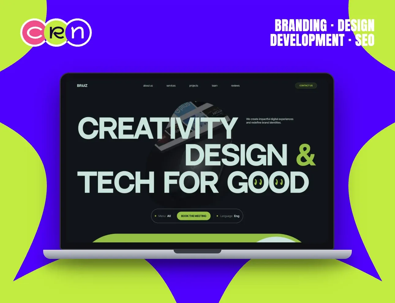
An agency homepage competes with every other agency homepage, so this one spends its whole hero on a single sentence.
Creativity, design & tech for good is set at the largest size the viewport allows, staggered across three lines, with project thumbnails drifting behind the letterforms.
Two smileys replace the O's in 'good'. It's the one piece of decoration on the screen, and it tells you the studio's temperature faster than an about page.
A floating pill dock carries the only three decisions (menu, book the meeting, language) and stays with you down the scroll.
View case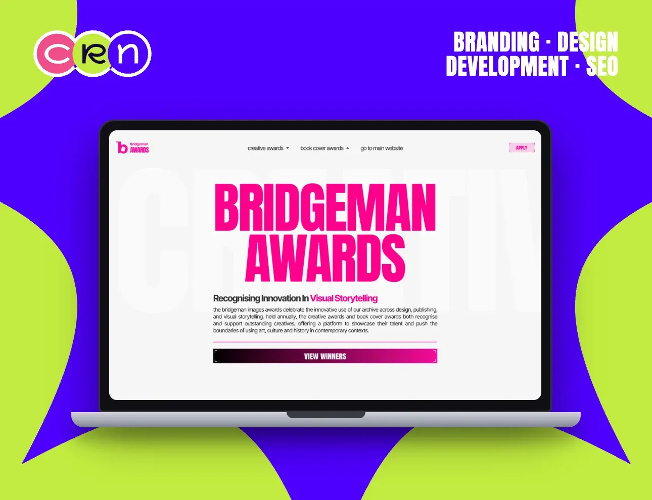
An awards programme has two visitors (people entering, and people reading the results) and one page has to serve both.
Apply sits in the nav for the first group; View Winners is the full-width button under the fold for the second. Neither one has to hunt.
The name is set as large as the screen allows, in magenta on white, with a ghosted CREATIVE running behind it, the whole identity carried by type alone.
The paragraph does the rest: what the awards celebrate, that they're held annually, and that both the creative and book cover programmes live here.
View case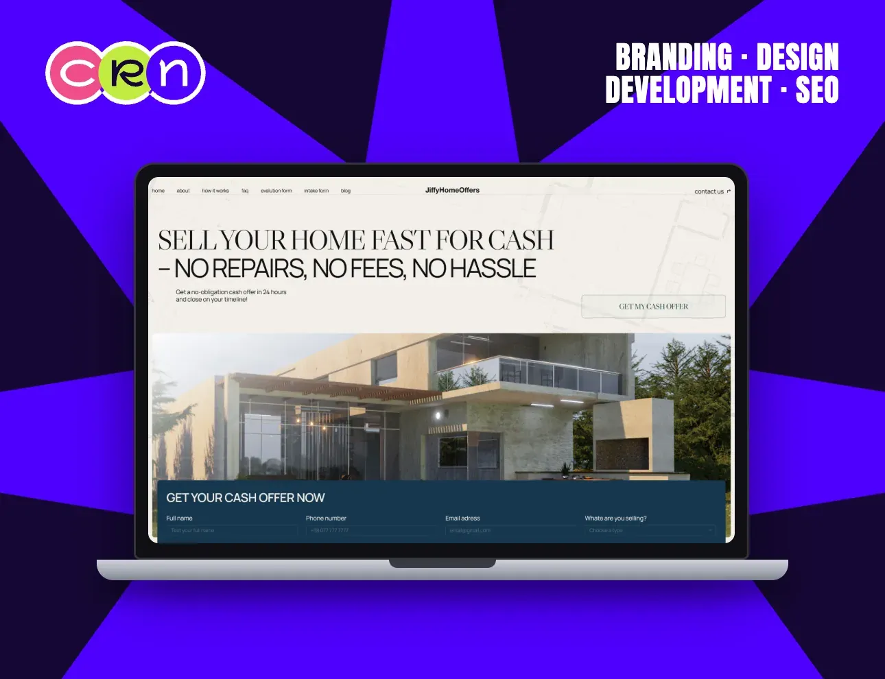
Someone selling a house for cash is usually solving a problem, not chasing a price. The headline is written to that.
Sell your home fast for cash: no repairs, no fees, no hassle. Three objections cleared in the same breath as the offer, and the terms restated underneath: a no-obligation cash offer in 24 hours, closing on your timeline.
The serif setting reads as a real-estate brand rather than a lead machine, which is exactly the difference this seller is watching for.
The intake form starts on the homepage, so the first field is filled before the visitor has decided they're filling in a form.
View case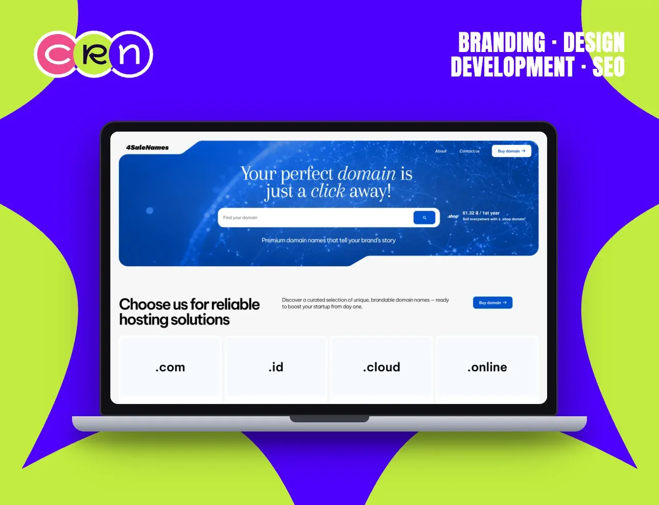
A domain marketplace has exactly one interaction, and everything on the page is arranged to get to it.
The search field sits dead centre of the hero, on a globe of network lines, with the promise directly under it: premium domain names that tell your brand's story.
The panel underneath answers the second question (why buy here) and puts the extensions themselves in tiles you can click: .com, .id, .cloud, .online.
Deep blue and white throughout, so the field and the buttons are the only bright surfaces on the page.
View case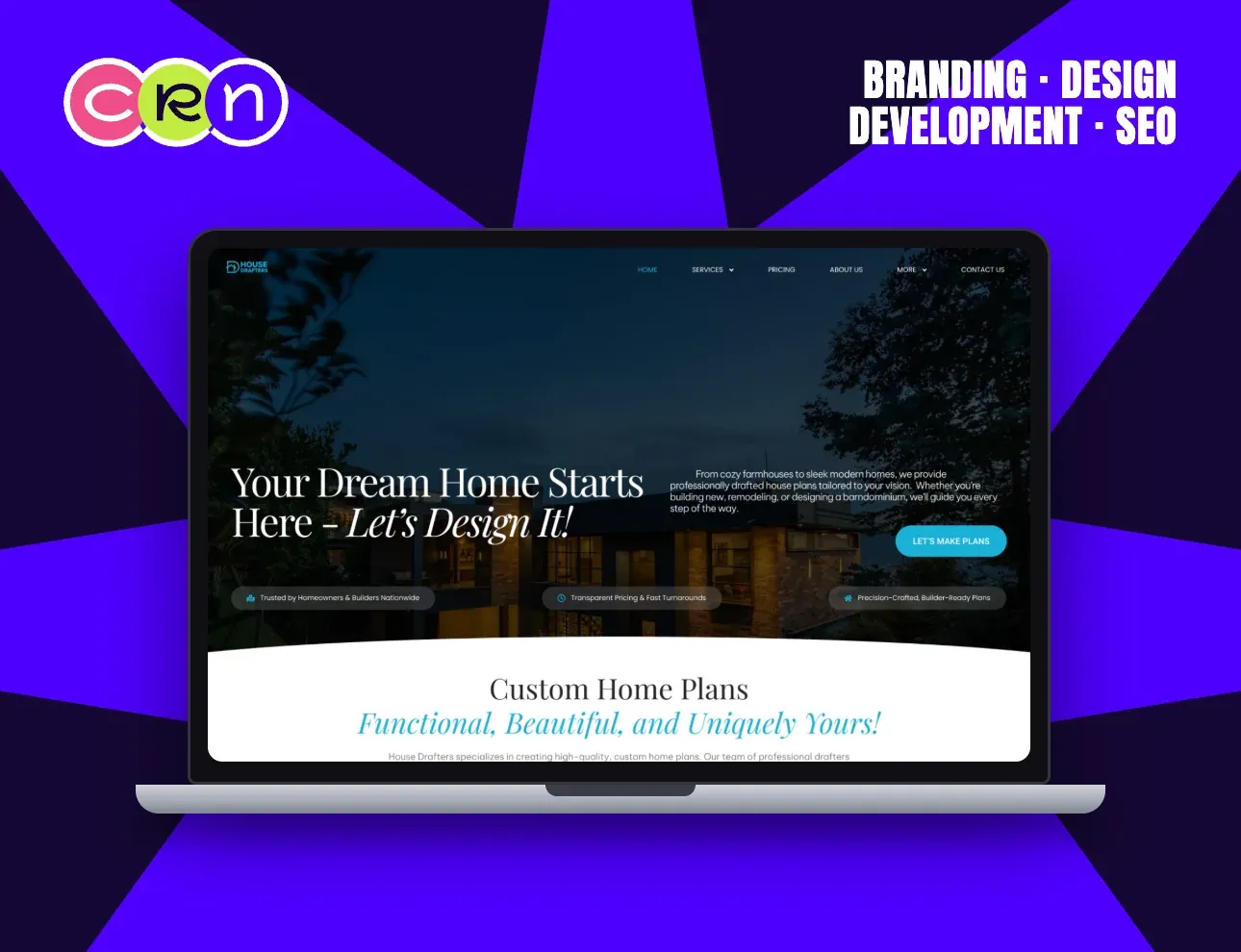
Drafting is a technical service sold to people in the most emotional purchase of their lives. The page holds both.
The headline is the dream (your dream home starts here, let's design it) and the paragraph beside it is the scope: farmhouses to modern homes, new builds, remodels, barndominiums.
Three chips ride the photograph and answer the practical worries in order: trusted by homeowners and builders nationwide, transparent pricing and fast turnarounds, precision-crafted builder-ready plans.
The section below turns straight to the product (custom home plans) so the visit moves from feeling to catalogue in one scroll.
View case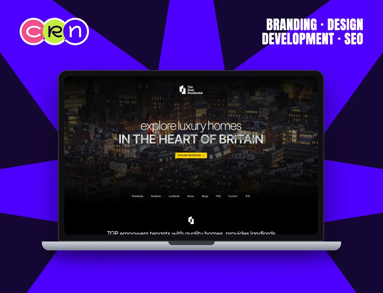
Student housing is chosen by students and paid for by everyone around them, so the page speaks to three audiences without splitting in two.
Properties, Students and Landlords each get their own nav entry, and the hero stays on the one line all three agree on: live, learn & thrive.
The photograph is a student walking into their own place, the moment being sold, not the floor plan.
A verification system is named in the band under the fold, and a 中文 switcher sits top-right, because a large part of this market arrives from abroad.
View case
So… how do
we make you feel?
Choose your vibe, we’re listening.